


- AME CAPITALS
- Trading Technology
- Help AME Trading
Part II. Technical Analysis / Chapter 1. Types of Charts
To begin studying technical analysis, it is necessary to familiarize oneself with the types of charts that reflect the movement of currency exchange rates. But before delving into the charts, let's define a few fundamental concepts. As we already know, in the process of trading on the Forex market, market makers quote currency pairs to each other. Each change in the buying and selling prices of a currency pair by a market maker is called a tick. The number of ticks can vary depending on the trading activity in the Forex market. In a volatile market (one with rapid changes and active trading), a market maker may quote a currency pair several times per minute. In a calm market, a currency pair may be quoted by a market maker once every few hours. Thus, the density of ticks on the time scale can vary, and each tick corresponds to two prices - the bid price and the ask price of the market maker.
In technical analysis of the Forex market, individual ticks are typically not considered separately. Instead, a trading period (time range) is examined. Commonly used time ranges include 1 minute, 5 minutes, 15 minutes, 30 minutes, 60 minutes, 1 day, 1 week, and 1 month. Within each examined period, there can be multiple ticks (quotes from market makers). As a result, the buying and selling prices within the trading period fluctuate. Therefore, within each time range, the following elements exist:
- Opening price (open): (open) – The average price at the beginning of the time range (calculated as the average of the buying and selling prices of the first tick within the time range).;
- Lowest price (low): (low) – The lowest buying price (bid) encountered in the market maker's quotes during the time range.;
- Highest price (high): (high) – The highest selling price (ask) encountered in the market maker's quotes during the time range.;
- Closing price (close): (close) – The average price at the end of the time range (calculated as the average of the buying and selling prices of the last tick within the time range).
All four price components of time ranges hold significant value in the technical analysis of the Forex market. Studying them can provide insights into market sentiment regarding the traded currency. However, numerical analysis of time ranges is not very convenient and is rarely used by traders, as forecasting is an inherently imprecise science. Therefore, to enhance information perception, time charts are constructed, visually representing the aforementioned price components. In technical analysis, five main types of charts are commonly distinguished:
- Tick Chart (Displays individual ticks as they occur.
- Line Chart (Represents price movements with a simple line connecting closing prices over time.);
- график баров (bar chart);
- Bar Chart (Illustrates price ranges within a specific time period using vertical bars. Each bar represents the high, low, opening, and closing prices.);
- Japanese Candlesticks ( Presents price information in a format resembling candlesticks. Each candlestick includes the opening, closing, high, and low prices.).
Point and Figure Chart: Utilizes Xs and Os to depict price movements, focusing on significant changes rather than specific time periods.
The x-axis (abscissa) of these charts represents the time axis with varying scales (trading periods). The y-axis (ordinate) represents the value of the quote at a given moment (the price of the base currency expressed in the quote currency).
The tick chart has the smallest scale. On this type of chart, vertical lines representing ticks are plotted every time the market maker quotes the currency pair. The time scale on the x-axis of the chart is very small, typically spanning a few seconds. The lower boundary of each tick represents the bid price of the market maker's quote, while the upper boundary represents the ask price.
Tick charts are rarely used in Forex market technical analysis due to the inconvenience of their perception caused by the small scale and the way information is displayed.
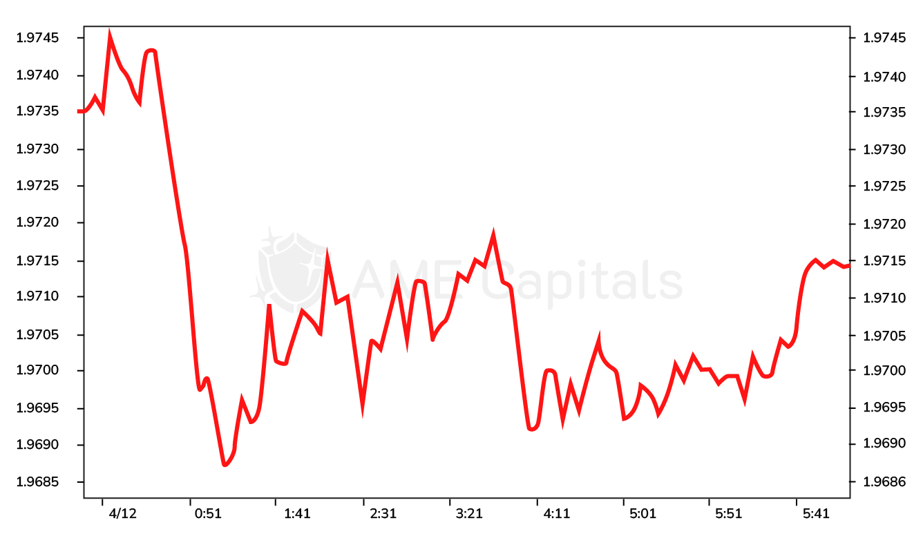
The next type of chart is the line chart. The time scale on this chart can be of any duration, but typically, widely used timeframes mentioned earlier in technical analysis are used. Only closing prices of the time periods are plotted on this chart. Each subsequent closing price is marked as a point on the chart and connected by a line to the closing price of the previous period. The result is a continuous line graph, as shown in the example of the GBP/USD quote.
TIn some variations of the line chart, the opening price, the high and low prices of the period, or even averaged combinations of these values are used for plotting. The line chart is visually easy to perceive, making it convenient for identifying technical analysis patterns and patterns that will be discussed in subsequent chapters. However, analyzing such a chart provides no information about price fluctuations within the time period, which is crucial for forecasting currency exchange rate changes. Additionally, it is not possible to determine if there were price gaps (or gaps) between the opening price of the current period and the closing price of the previous period, and this information is important for determining market volatility in the Forex market. In other words, a line chart represents an entire time period with just a single point, which naturally does not reflect the complete picture of currency exchange rate movements. Therefore, line charts are used less frequently in technical analysis compared to other types of charts that will be discussed later.
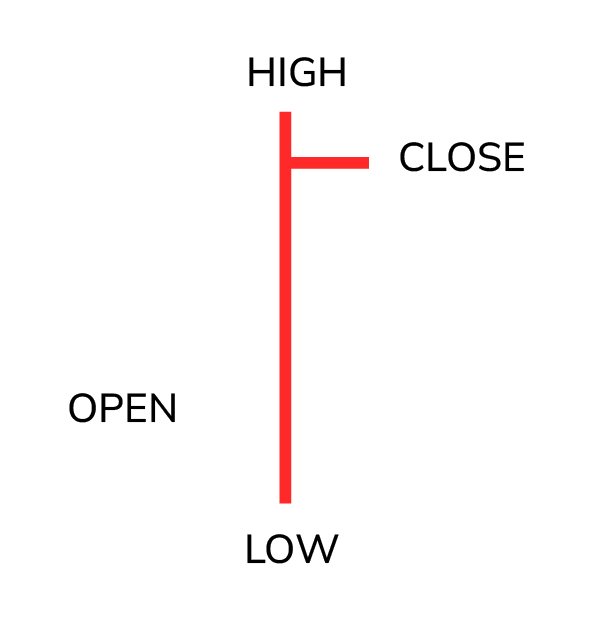
The next type of chart we will discuss is called a bar chart. A bar is represented by a vertical line with two branches extending on the left and right sides. An example of such a figure is shown in the diagram.
Each bar, depending on the scale of the x-axis of the chart, corresponds to a specific trading period. Notably, each bar simultaneously represents all four prices of the trading period. The opening price (open) is represented by the level of the left branch, and the closing price (close) is represented by the right branch. The lower level of the bar represents the low, and the upper level represents the high price value for the given time range. If the left branch is below the right branch, the price increased during the trading period. Conversely, if the left branch is above the right branch, the price decreased. An example of a bar chart is shown in the diagram using the GBP/USD quote as an example.
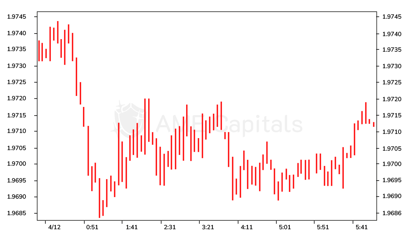
One of the alternative English names for a bar chart is the OHLC bar, which stands for Open, High, Low, Close - the four price components of a trading period. In the Forex market literature, you may also come across the term HLC bar, which represents bars where the opening price (left branch) is not displayed, and it is assumed to be the same as the closing price of the previous bar. In other words, it is assumed that the bar chart does not have price gaps, and the opening price is redundant for analysis purposes.
As one can guess, the bar chart allows you to determine the nature of currency fluctuations in Forex within each trading period. However, it is not very convenient for identifying the trend of currency exchange rates because the opening and closing prices of trading periods, represented by the branches, are visually challenging to perceive.
Another type of chart that we will discuss is called Japanese candlesticks. As the name suggests, candlesticks were invented in Japan and were initially used to analyze price changes in the rice market in the Land of the Rising Sun. Later on, the concepts underlying this type of chart were borrowed and became widely used for analyzing financial markets worldwide, including the Forex market. A candlestick consists of a body (real body), a lower shadow (lower wick or shadow), and an upper shadow (upper wick or shadow), as shown in the illustration.
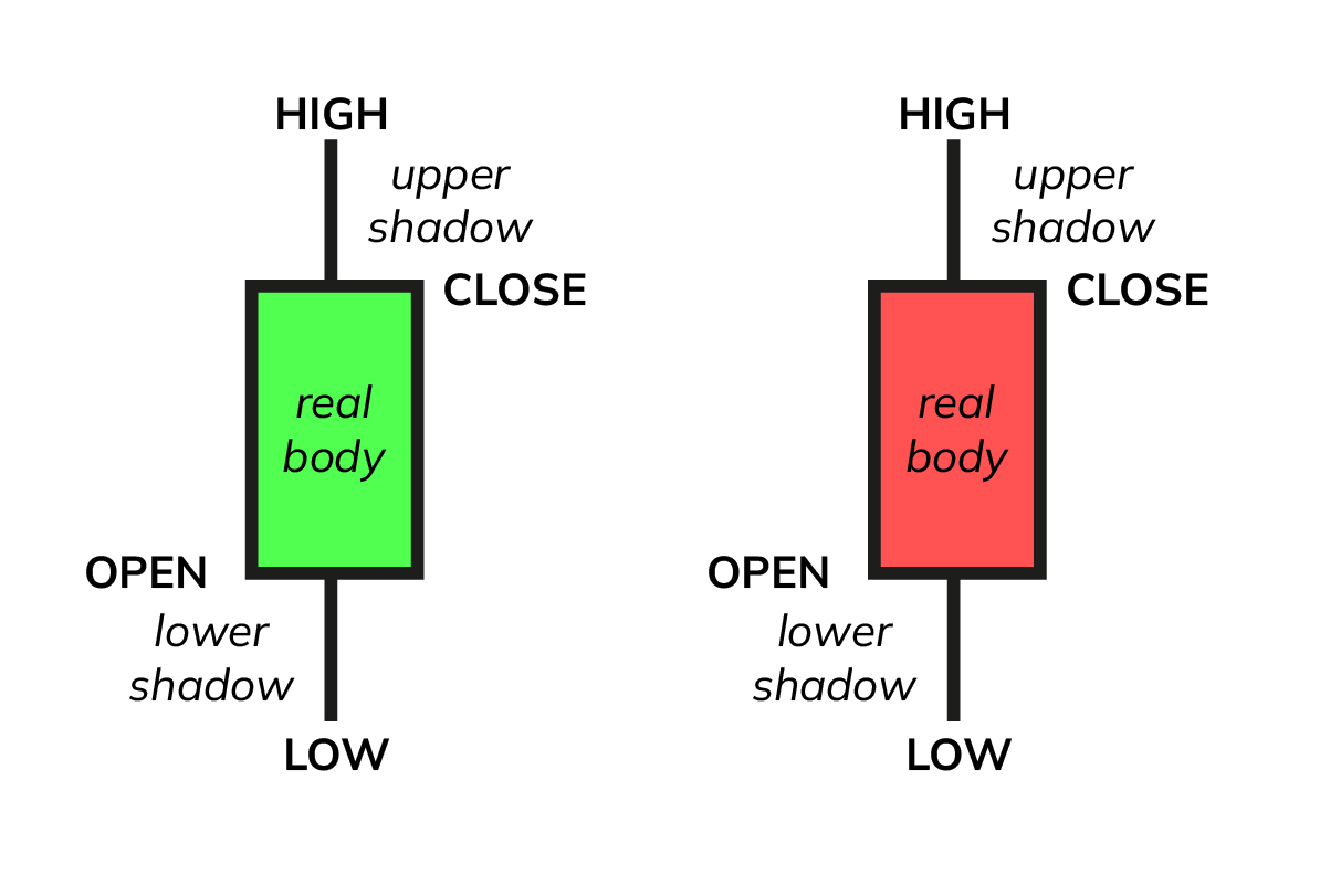
Each candlestick corresponds to a specific trading period depending on the chosen time scale on the x-axis. Candlesticks can be of two types, and their naming conventions may vary. They can be referred to as "hollow and filled," "green and red," or similar terms. A hollow (green) candlestick, known as "yosen," represents a trading period in which the closing price is higher than the opening price, indicating a period of price increase. A filled (red) candlestick, known as "insen," represents a trading period in which the closing price is lower than the opening price, indicating a period of price decrease. In the materials on this website, we will follow the concept of green and red candlesticks.
The opening price (open) of a green candlestick is determined by the lower level of its body, while the opening price of a red candlestick is determined by the upper level of its body. The closing price (close) of a green candlestick is determined by the upper level of its body, while the closing price of a red candlestick is determined by the lower level of its body. The minimum price of the trading period (low) is determined by the lower level of the lower shadow of the candlestick, and the maximum price of the trading period (high) is determined by the upper level of the upper shadow of the candlestick. An example of a Japanese candlestick chart for the GBP/USD currency pair is shown in the illustration.
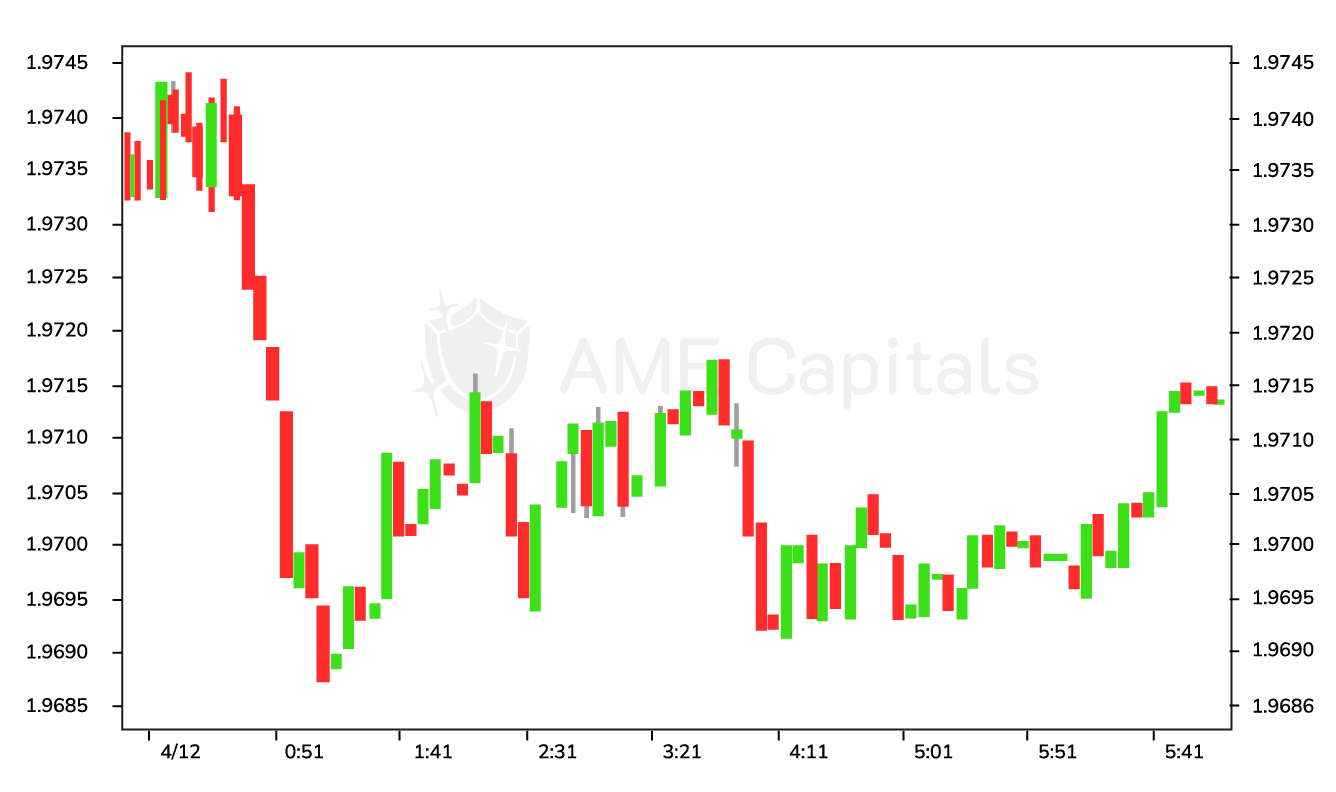
Japanese candlesticks, despite their uniqueness, are widely used in technical analysis of financial markets. They are highly convenient for visually perceiving information about currency price changes in different trading periods, which is why they are widely utilized by traders. Depending on the size of the candlestick's body and the length of its shadows, Japanese candlesticks are classified into patterns. There are patterns that serve as indicators of a confirmed trend, and there are patterns that indicate a trend reversal. These patterns are an important part of studying technical analysis in the Forex market and will be discussed in detail in the subsequent chapters of the website.
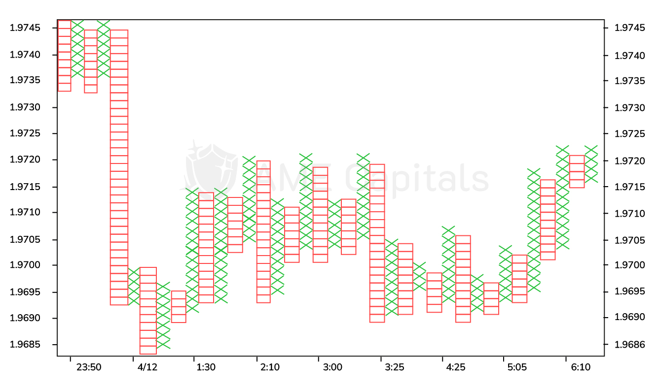
The last type of chart we will discuss is the point and figure chart. This type of chart is less commonly used among traders compared to the previously mentioned chart types, but its skillful use can provide valuable confirmation or reversal signals. The unique feature of this chart is that the time axis is non-uniform and often not displayed at all. The x-axis represents a series of columns. The chart is constructed using the closing price of the selected trading period (scale). Two constants are defined for the chart. The first constant (box size) determines the minimum price change required. It can be expressed either in terms of points or in terms of price units, depending on the approach used (trading platform). If the price increases and the change exceeds the value of the first constant, a "X" is added on top of the current column. This process continues until the price starts to decline. In that case, the second constant is taken into account, which determines by how many units of the first constant the price must change to be considered a trend reversal. Let's assume that in our example, the value of the second constant is 3. This means that we will move to the next column and draw a "O" at the corresponding level only if the price drops by three times the value of the first constant. After changing the column, the chart construction continues in the opposite manner. This approach allows filtering out statistical noise and disregarding insignificant price fluctuations. If the price decline does not reach the threshold of three times the value of the first constant and subsequently starts to rise again, we wait for it to reach the previous peak, exceed it by the value of the first constant, and add another "X" in the first column. It is worth noting that the number 3 in the example is not arbitrary but considered a "magic number" in technical analysis of financial markets and is used in various tools. The point and figure chart is shown in the figure using the example of GBP/USD quotes.
Indeed, in this chapter, we have covered the main types of charts used in technical analysis in Forex. In addition to these charts, there are other less common types, such as volume candlesticks (candlevolume), equivolume charts (equivolume), and others. The ability to interpret data on charts is an essential part of successful technical analysis in financial markets and, consequently, successful trading.