


- AME CAPITALS
- Trading Technology
- Help AME Trading
Part II. Technical Analysis / Chapter 9. Moving Averages
Our Forex education continues, and next we will discuss moving averages - the simplest type of technical indicators in financial markets. Due to the fact that these technical analysis indicators are the oldest form of analysis, they are most commonly used by professional traders, making them of great interest to us. After all, we remember that in order to be a successful Forex trader, we need to emulate the behavior model of professionals in this market.
In the most general sense, a moving average allows us to gain an understanding of the established trend and identify effective entry and exit points for positions. It is commonly believed that moving average curves define the trend. We will examine three types of moving averages as technical analysis indicators: simple moving average, weighted moving average, and exponential moving average. Each of these indicators has its own characteristics, strengths, and weaknesses. They will all be discussed in detail.
Part II. Technical Analysis / Chapter 10. Simple Moving Average
The simplest form of a moving average is called the simple moving average (SMA). This type of technical analysis indicator represents a curve on a price chart whose main purpose is to smooth out (filter) price fluctuations and show the primary price trends in a currency pair. The image below shows the price chart of USD/JPY on a daily timeframe with plotted simple moving average curves. The curves vary based on the smoothing coefficient values (10, 30, and 60), which will be discussed further below.
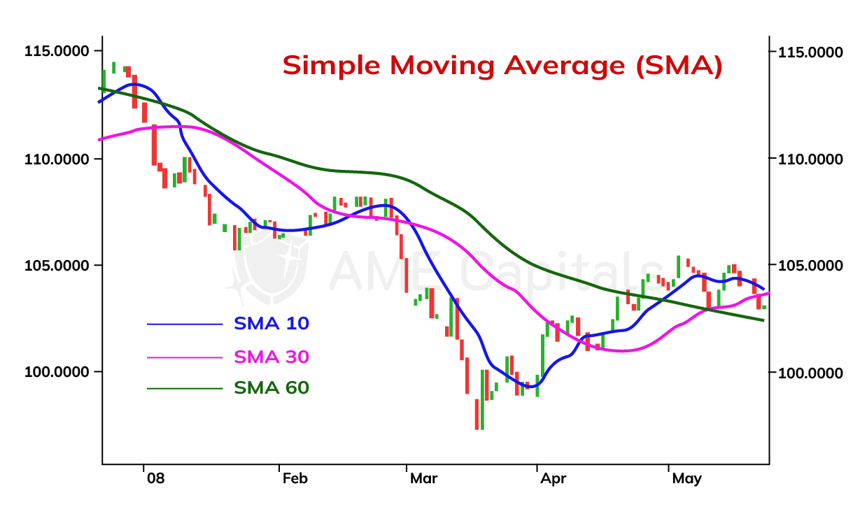
As seen from the chart, the curves of the Simple Moving Average approximate the price chart. To understand the meaning of these curves, it is necessary to understand the principle of their construction. The essence lies in considering several previous data points, depending on the chosen smoothing coefficient, for a specific point in time on the x-axis. The values (prices) of all the points are summed up and divided by the coefficient. Therefore, from a mathematical point of view, the Simple Moving Average is an arithmetic mean. Most technical analysis applications automatically plot the curves of moving averages, but it is still important to understand the mathematical formula behind their construction.
For a smoothing coefficient value of 'n', the mathematical formula for calculating the Simple Moving Average is as follows:
SMA = (P(n) + P(n-1) + … + P(1)) / n,
where P(n) is the closing price of the current trading period, P(n-1) is the closing price of the previous trading period, and so on. The larger the smoothing coefficient value, the more previous trading periods are taken into account, resulting in a smoother curve. As seen from the formula, each of the 'n' points has an equal weight in constructing the Simple Moving Average curve. This means that for a specific time point (trading period), not only the current price but also a series of preceding prices are considered in equal proportions. Therefore, the higher the coefficient value, the less the Simple Moving Average curve resembles the price chart. Curves with a higher coefficient can indicate long-term trends, while those with a lower coefficient can indicate short-term trends. The slope of the curves can provide insight into the strength (velocity) of the market movement. Sometimes, in addition to closing prices, opening prices, minimum prices, and maximum prices are also used in the analysis when constructing the curves.
The curves of the Simple Moving Average allow us to forecast changes in currency exchange rates as they reflect price movements. The larger the smoothing coefficient of the Simple Moving Average, the smoother the curve becomes. A smoother curve reacts more slowly to market price changes. Therefore, when analyzing Simple Moving Averages with larger coefficient values, there is a risk of missing out on good market entry or exit opportunities, thus potentially missing out on profits. The opposite is also true. The smaller the smoothing coefficient of the Simple Moving Average, the less smooth the curve becomes. A less smooth curve reacts faster to market price changes. However, when analyzing Simple Moving Averages with smaller coefficient values, there is a risk of making premature decisions regarding market entry or exit, leading to losses. This is because such an indicator is more susceptible to statistical noise, which refers to sudden and random price fluctuations (spikes). Such sudden fluctuations occur in the Forex market during the release of important fundamental economic indicators or during interventions by major market participants. Thus, there is a trade-off between timely position entry and the risk of erroneous position entry.
Moments of the greatest divergence between two curves of the Simple Moving Average with different parameters are understood as a signal for a possible trend change.
The Simple Moving Average curve has one significant drawback - all the prices that make up this indicator have equal weight. It would be more logical to give greater weight to recent prices and lesser weight to older prices. Such an approach would help avoid the problem of analyzing price charts with sudden price fluctuations mentioned earlier. After all, these fluctuations would have a greater impact on the current time point of the Moving Average curve and a lesser impact on subsequent time points. This approach is implemented in the Exponential Moving Average and Weighted Moving Average indicators, which will be discussed in the upcoming chapters of the Forex learning portal.
Part II. Technical Analysis / Chapter 11. Weighted Moving Average
The Simple Moving Average has one significant drawback: when calculating it, all prices from previous trading periods are given equal weights as the price of the current trading period. This leads to a significant lag of the Simple Moving Average curve behind the price chart, especially when a large number of trading periods are considered, i.e., when using a large smoothing coefficient. As a result, trading signals are delayed, as a considerable portion of the trend has already occurred by the time the signals are generated.
To address this issue, it is more logical to assign different weights to each trading period in the moving average calculation, based on their distance from the current period. The current trading period receives the highest weight, the previous period receives a slightly lower weight, and so on. This approach is implemented in a technical indicator that will be discussed in this chapter: the Weighted Moving Average (WMA).
The figure compares the curve of the Weighted Moving Average to the curve of the Simple Moving Average with a smoothing coefficient of 30. It can be seen that the Weighted Moving Average curve provides a better approximation of the price chart.
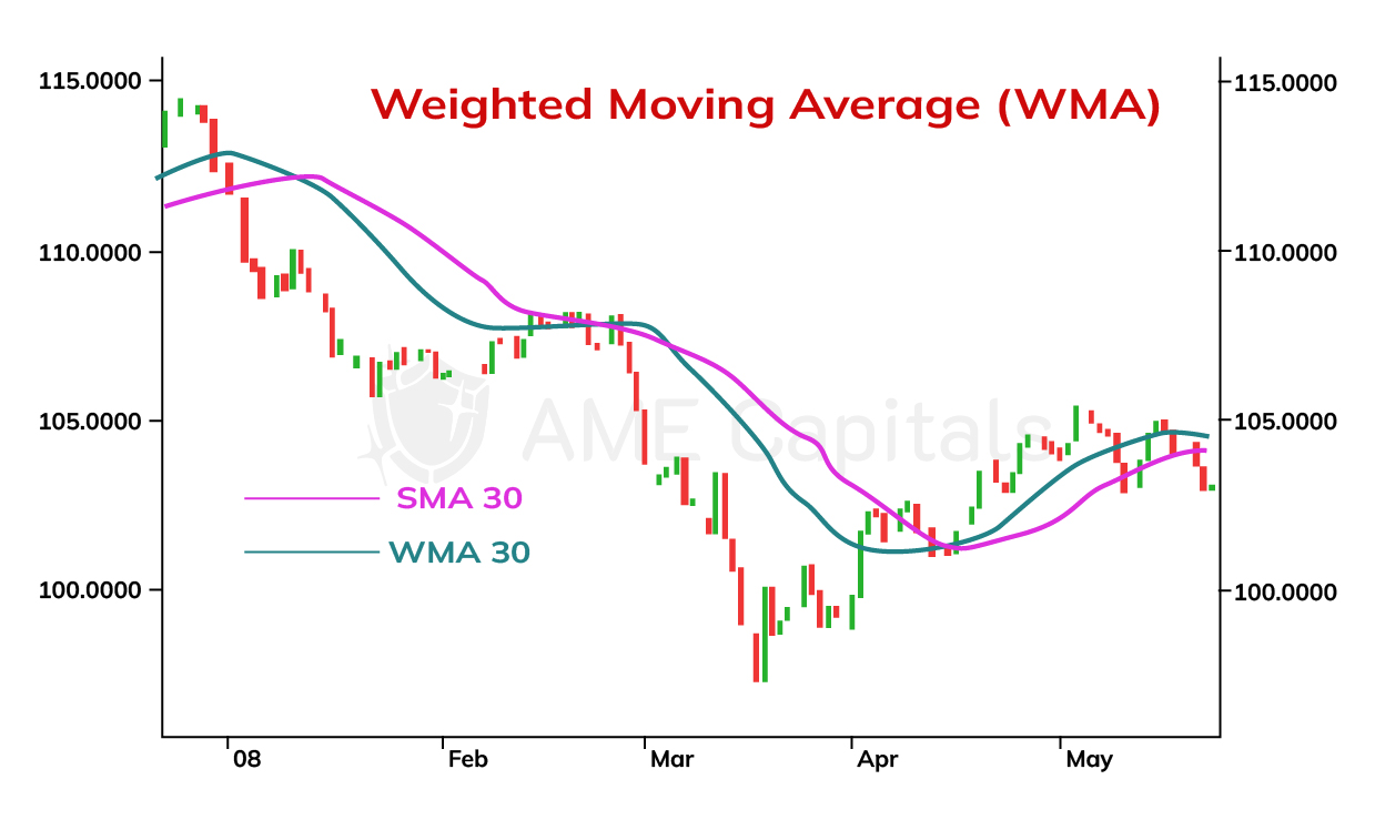
The mathematical formula for calculating the Weighted Moving Average with a smoothing coefficient of n is as follows:
WMA = (n * P(n) + (n-1) * P(n-1) + … + P(1)) / (n + (n-1) + … + 1),
where P(n) represents the closing price of the current trading period, P(n-1) represents the closing price of the previous trading period, and so on. It's not necessary to memorize the calculation formula since most technical analysis applications automatically plot the curves of technical indicators.
It's worth noting that in some variations of the formula for calculating the Weighted Moving Average, a slightly different (non-linear) distribution of weights is used.
The curves of the Weighted Moving Average are interpreted similarly to the curves of the Simple Moving Average in Forex technical analysis. They provide similar signals for market entry and exit. During the analysis, it is important to understand that the Weighted Moving Average curves react more quickly to price changes since they assign greater weights to recent trading periods. This is particularly relevant in the case of unforeseen rapid market changes during the release of economic news or interventions by major participants in the Forex market.
Part II. Technical Analysis / Chapter 12. Exponential Moving Average
Another variation of the moving average that we will discuss is the Exponential Moving Average (EMA). The EMA can be understood as a weighted moving average where the weights decrease exponentially with the distance of the trading period from the current one. This distribution allows us to focus on current prices and not miss important trading signals. In the chart, the EMA curve is compared to the Simple Moving Average curve for a smoothing coefficient value of 30. It can be observed that the EMA curve provides a better fit to the price chart and generates earlier trading signals.
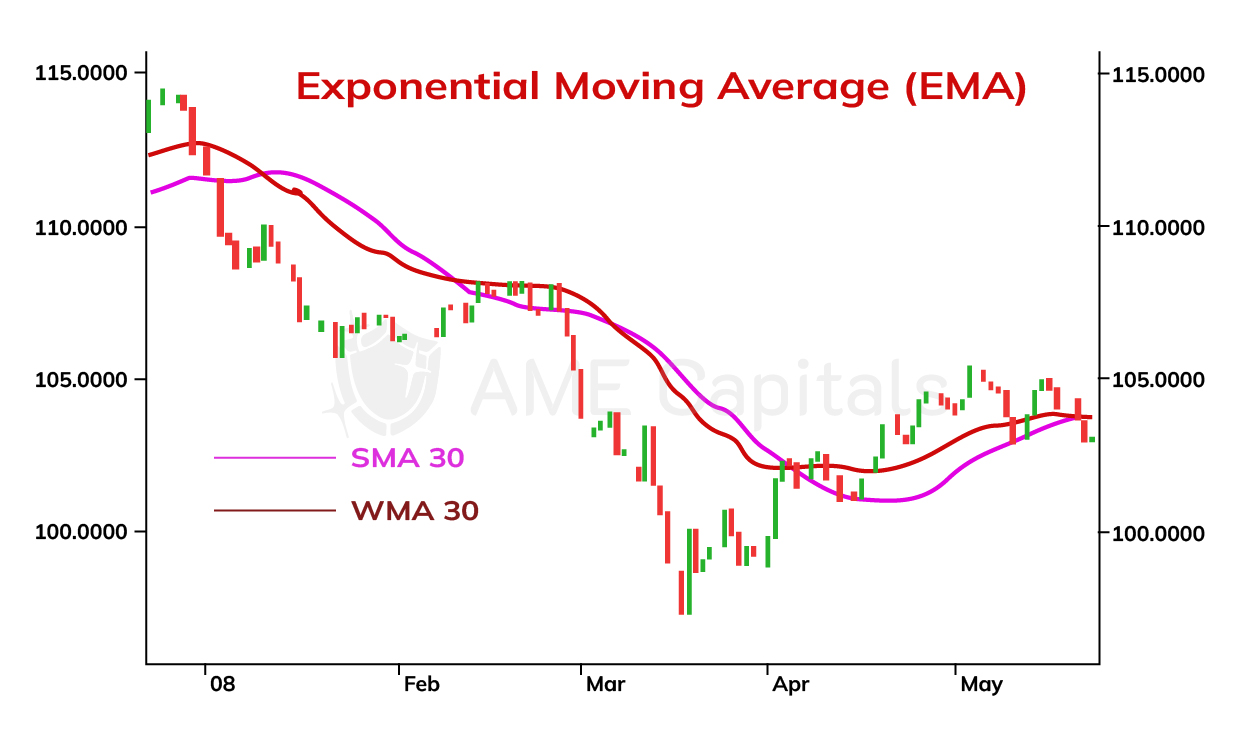
The mathematical formula for calculating the Exponential Moving Average (EMA) is recursive and, for a smoothing coefficient value of n, it is defined as follows:
EMA(n) = k * P(n) + (1-k) * EMA(n-1),
where P(n) is the closing price of the current trading period, EMA(n-1) is the value of the EMA calculated for the previous trading period, and k is the smoothing coefficient. The initial value EMA(1) is set equal to the price of the first trading period, i.e., P(1). The higher the value of the smoothing coefficient k, the better the EMA curve approximates the price chart, as it assigns more weight to the current prices. Conversely, for lower values of the smoothing coefficient k, more weight is given to past trading periods. Different trading platforms may use different values for the coefficient. In practice, a commonly used value is 2/3.
The interpretation of exponential moving average (EMA) curves is similar to that of simple moving average (SMA) curves in technical analysis of the Forex market. They provide similar signals for market entry and exit. During analysis, it is important to know the value of the smoothing coefficient used by the trading platform. EMA curves react faster to price changes when the coefficient value is higher because they give more weight to the current trading period. This is particularly relevant in the case of unforeseen rapid market changes during the release of economic news or interventions by major participants in the Forex market.
EMA curves are often used in short-term trading as they allow for capturing quick price changes in the currency market. On the other hand, SMA curves are used in long-term trading as they effectively indicate long-term trends. Therefore, the choice of a technical indicator depends on the trading strategy employed by the trader at a specific moment in time.
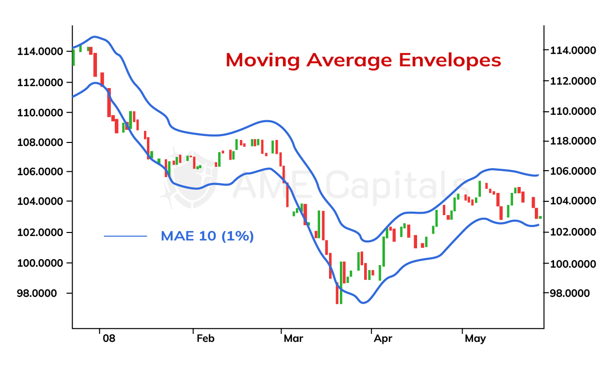
Part II. Technical Analysis / Chapter 13. Moving Average Envelopes
Moving averages, which we have discussed in previous chapters as part of Forex education, have found another application in a technical indicator called Moving Average Envelopes. The essence of this indicator is that the moving average line is shifted up and down by a certain distance, forming a band. The distance of the shift depends on the market situation and is typically determined empirically. The chart illustrates the Moving Average Envelopes using the example of the USD/JPY exchange rate.
The upper and lower envelope lines on the chart represent a simple moving average curve with a period of 10, shifted up and down by a distance equal to 1% of its value. In general, the mathematical formula for constructing moving average envelopes is as follows:
MAE = (1 ± k/100) * MA,
where MA is the moving average, and k is the shift coefficient expressed in percentages. It is worth noting that on some trading platforms, different coefficients may be used for the upper and lower shifts.
The shift coefficient is selected in such a way that the lower and upper envelope lines serve as support and resistance curves for the price chart. It should be understood that moving average envelopes do not incorporate market volatility or the speed of price changes. Therefore, it is not always easy to choose the right coefficient for a rapidly changing market.
The main idea behind moving average envelopes is that the price fluctuates around its average value. It is commonly believed that any significant deviation of the price from its average value will eventually lead to a return to the mean. However, it is important to note that this statement holds true in the absence of a well-defined trend and should be approached with some skepticism. In Forex market analysis, there is no 100% guarantee that any particular indicator will work; there is only a certain degree of probability supported by statistical research on historical data.
From a psychological standpoint of trading in the Forex market, the purpose of this technical indicator can be explained as follows. If market movement is not driven by significant external factors such as political events or the release of economic news, then any deviation from the average is a result of currency speculation. This leads to the market becoming overbought or oversold at the boundaries of the moving average envelopes. Many traders understand this and aim to close their positions at that point. Consequently, the price returns to its average level.
Therefore, a buying signal can be indicated when the price crosses the simple moving average curve from top to bottom and then approaches or crosses the lower moving average envelope. In such a case, there is a high probability of a trend reversal, and the price is likely to start rising again. The opposite is true for a selling signal when the price crosses the simple moving average curve from bottom to top and then approaches or crosses the upper moving average envelope. In this scenario, there is a high probability of a trend reversal, and the price is likely to start falling again. It is desirable for the upcoming price increase or decrease to be confirmed by several other technical analysis indicators or reversal patterns.
Moving average envelopes can be constructed based on any type of moving average: simple moving average, weighted moving average, or exponential moving average. However, the most commonly used is the simple moving average. It is important to understand that moving average envelopes do not take market volatility into account, so they can often generate many false trading signals or provide signals that lag significantly behind price movements. The concept of moving average envelopes has evolved into the development of Bollinger Bands, another technical indicator that incorporates price volatility. This indicator will be discussed in the next chapter.
Part II. Technical Analysis / Chapter 14: Bollinger Bands
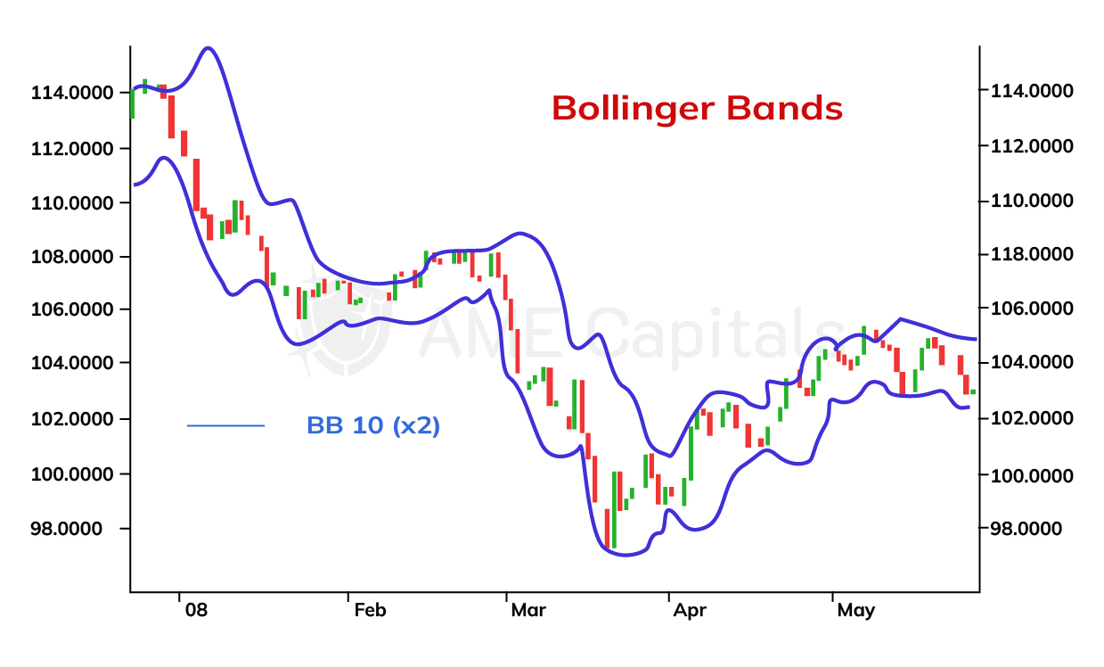
In this chapter, we will discuss Bollinger Bands. The concept of Bollinger Bands is very similar to that of moving average envelopes discussed in the previous chapter, and they are used to determine optimal entry points in Forex and other financial markets. However, unlike moving average envelopes, Bollinger Bands are well-suited for analyzing fast-changing (volatile) markets.
Bollinger Bands consist of two boundary lines that lag behind the moving average curve at a certain distance. However, this distance is not fixed as in the case of moving average envelopes; instead, it is equal to the value of the standard deviation multiplied by a specific coefficient. The standard deviation is a mathematical measure and represents the square root of the variance. These concepts are directly related to probability theory and mathematical statistics, and their detailed exploration goes beyond the scope of this Forex learning platform. Trading platforms automatically construct Bollinger Bands, but curious readers can familiarize themselves with the formula for calculating standard deviation. The technical indicator discussed in this chapter is illustrated using the USD/JPY currency pair.
The mathematical formula for constructing Bollinger Bands is as follows:
BB = MA ± k * stdDev,
where MA represents the moving average, stdDev is the standard deviation, and k is the coefficient of the standard deviation. You can use any type of moving average, but the simple moving average is the most commonly used.
According to probability theory, if segments equal to the standard deviation are plotted on both sides of the mean value, the resulting band will encompass at least 68.26% of the random variable values. If segments equal to two standard deviations are plotted, the interval will encompass at least 95.44% of the values. For a triple value of the standard deviation, this percentage increases to 99.73%. These statements hold true if the random variables have a normal distribution, which to some extent can be applied to price fluctuations in the Forex market.
When constructing Bollinger Bands, the most commonly used value for the coefficient of the standard deviation, k, is 2. With this value, approximately 95% of prices fall within the price range bounded by the band lines. Bollinger Bands can be applied in volatile markets because the standard deviation, which is the basis for their construction, takes into account the speed of price changes. To calculate the standard deviation, you need to select a calculation period. Typically, the same value is used for the calculation period as for the smoothing coefficient of the moving average.
The technical indicator discussed in this chapter has several interesting properties from an analytical standpoint. When prices oscillate within a horizontal range and there is no clearly defined trend in the Forex market, the bands contract (squeeze). However, when a new trend begins to form, the bands start to expand. The longer prices remain in a horizontal range, the stronger the subsequent breakout and formation of a new trend will be, and the faster the bands will diverge.
Regarding Bollinger Bands, the same principles that apply to moving average envelopes hold true. Specifically, prices should gravitate towards the mean. Touching or crossing the upper or lower band indicates an excessive deviation (market overbought or oversold), and is likely to be followed by a corrective movement back towards the mean. In most cases, the pullback tends to be at least the size of the moving average. An exception occurs when there is a strong trend in the market after a prolonged period of price consolidation within a horizontal range. This situation is represented on the chart by a sharp expansion of the bands following an extended period of contraction.
In general, the contraction of Bollinger Bands, forming a "neck" shape, is a strong signal that corresponds to a significant reduction in price volatility and can be easily visually identified on the chart. Such a contraction indicates an abnormal market condition and will eventually be accompanied by an expansion movement, forming a new downtrend or uptrend.
Bollinger Bands work equally well on all types of charts, from minute charts to daily charts. However, when making decisions about opening or closing a position, it is never advisable to rely solely on one technical indicator. Your assumption should always be confirmed by multiple indicators. The more tools used to forecast price changes in Forex, the more signals align, increasing the likelihood of reliability. By combining different indicators and analyzing various aspects of the market, traders can gain a more comprehensive understanding of price movements and make more informed trading decisions.
Part II. Technical Analysis / Chapter 15. Moving Average Convergence Divergence
The next technical analysis indicator we will discuss is called Moving Average Convergence Divergence (MACD). It represents a further development of applying moving averages theory to financial market analysis, particularly in the Forex market. With the help of this indicator, one can identify points of weakening and potential reversal in an established trend. Since the primary goal of any Forex trader is to trade along with the trend, the MACD indicator allows for identifying the most suitable moments to close positions when the strength of the main trend diminishes and a future reversal becomes possible, as well as appropriate moments to open positions if such a reversal is confirmed.
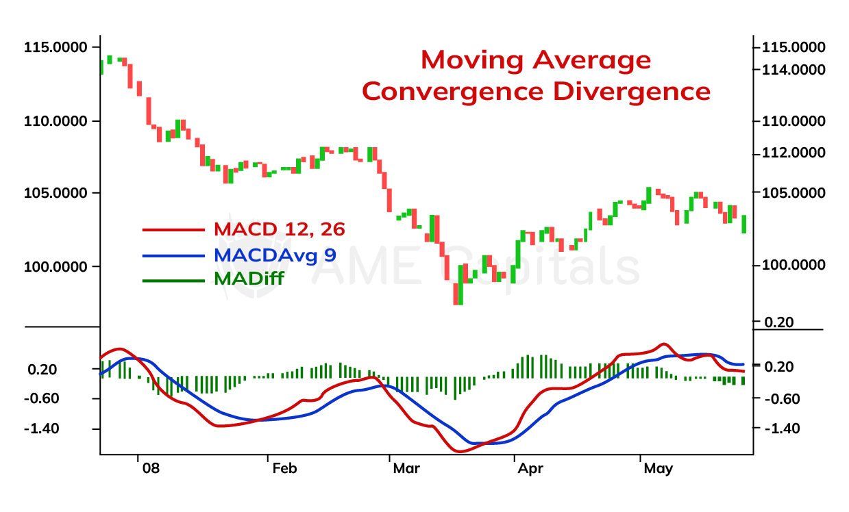
To construct the Moving Average Convergence Divergence (MACD) indicator, we use exponential moving averages (EMA) that were previously discussed in the corresponding chapter of Forex education. The indicator consists of two curves and a histogram, which are constructed as follows. First, two periods (short and long) are chosen to calculate the EMA curves. In practice, the most commonly used smoothing coefficients are 12 and 26. The curves themselves are not plotted on the price chart, but the difference between them, denoted as MACD, is calculated and represented as a separate curve below the price chart. Subsequently, an EMA is calculated for the obtained curve using a specific period. The smoothing coefficient most frequently used in trading platforms for this purpose is 9. The resulting curve is denoted as MACDAvg and is also plotted below the price chart. These two curves oscillate and intersect, indicating points of weakening in the main trend and potential further reversal. The difference between the curves is represented as MACDDiff and is plotted as a histogram below the price chart. The moments at which the histogram takes a zero value correspond to the intersections of the aforementioned curves and therefore define key signals of the indicator.
The mathematical formulas for calculating the components of the Moving Average Convergence Divergence indicator are as follows:
MACD = EMA(P,12) – EMA(P,26) MACDAvg = EMA(MACD,9) MACDDiff = MACD – MACDAvg,
where EMA(x, y) represents the exponential moving average of function x with a smoothing coefficient of y, P denotes the function of the price chart.
In the chart, the Moving Average Convergence Divergence is shown as an example using the USD/JPY currency pair. Below the price chart, you can see the red MACD curve, the blue MACDAvg curve, and the MACDDiff histogram.
The moments when the red curve crosses the blue curve from above to below determine the weakening of an uptrend and the potential beginning of a downtrend. Conversely, the moments when the red curve crosses the blue curve from below to above indicate the weakening of a downtrend and the potential start of an uptrend. The word "potential" is used deliberately because the weakening of a trend does not always indicate the formation of the opposite trend but can be a temporary correction within the main price movement.
The moment of intersection between the two curves is determined by the zero level on the histogram and is called convergence. The opposite phenomenon, when the histogram rises along with an increasing distance between the curves, is called divergence. It is precisely due to these phenomena that the technical analysis indicator discussed in this chapter obtained its name.
The stronger the divergence between the curves, the stronger the trend. Therefore, if the curves start to diverge significantly after crossing, it indicates the formation of a new trend and can be considered a trading signal for buying or selling, depending on the direction of the trend. For convenience, one can analyze not the visual distance between the curves but the height of the histogram bars, which essentially represents the same information.
It is true that most technical analysis indicators based on moving averages provide lagging signals due to their inherent construction. The indicator we are discussing, the moving average convergence-divergence (MACD), is no exception, as it essentially represents a moving average of a moving average. In other words, the MACD indicator lags behind the main price movement and generates signals with a delay. However, despite this lag, it remains one of the most commonly used indicators in technical analysis of the Forex market.
Part II. Technical Analysis / Chapter 16. Parabolic Stop and Reverse (SAR) System
The next technical analysis indicator that deserves attention in Forex education is the Parabolic Stop and Reversal system, also known as SAR. This indicator was developed by J. Welles Wilder Jr., a renowned trader who made significant contributions to the research and development of technical analysis in financial markets. By properly applying this indicator, you can reduce trading errors and potentially increase profitability.
The Parabolic SAR indicator gets its name from the shape it takes on the price chart. The parabolic shape of the indicator is explained by its mathematical formula, which will be discussed below. An important condition for using this indicator in Forex market analysis is the presence of a clearly defined trend. In such cases, the indicator can provide a good signal of trend weakening or reversal, indicating a potential opportunity to close a position in one direction and open a position in the opposite direction. However, if prices are oscillating within a horizontal range, this indicator may generate many false signals. Therefore, before using this indicator and relying on its signals, it is important to confirm the presence of an established trend in the analyzed currency pair. This can be done by using other technical analysis tools we have already covered, such as support and resistance levels, trend reversal patterns, trend continuation patterns, moving averages, Bollinger Bands, moving average convergence-divergence, and others.
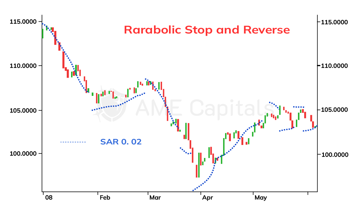
In the example of the USD/JPY currency pair, the Parabolic SAR indicator is presented in the figure.
As seen in the chart, the indicator consists of dots that form a curve. Each dot corresponds to a specific trading period, depending on the chosen price chart scale, but typically daily charts are used. If the indicator curve is below the price chart, it indicates an uptrend. If the indicator curve is above the price chart, it indicates a downtrend. When the indicator curve intersects the price chart, it signals a weakening of the trend and a high probability of its reversal. The proximity of the Parabolic SAR curve to the price chart indicates a weakening trend. The distance between adjacent indicator dots also represents the strength of the trend - the greater the distance, the stronger the trend. However, remember that a trend can reverse direction rapidly!
As can be observed, the indicator curve is not continuous. At the point of intersection between the curve and the price chart, the next point of the indicator "jumps" to the opposite side of the price chart. This behavior of the Parabolic SAR indicator is determined by a well-defined algorithm used for its construction. The algorithm is based on two concepts: the extreme point and the acceleration factor. In an uptrend, the extreme point is the highest price reached during the trend, while in a downtrend, it is the lowest price. Once the Parabolic SAR indicator signals a trend reversal, the algorithm switches to the opposite calculation method. When this signal occurs, the acceleration factor is reset to its initial value, often set at 0.02, which represents 2%. When the closing price of the current trading period in an uptrend exceeds the last recorded extreme point, the acceleration factor is increased by 2%, and the extreme point is updated. The same increase in the acceleration factor and update of the extreme point occurs when the closing price of the current trading period is below the extreme point in a downtrend. The indicator is calculated in advance, meaning that the data of the current day is used to calculate the indicator value for the next day. The mathematical formula for calculating the Parabolic SAR indicator is recursive and takes the following form:
SAR(n+1) = SAR(n) + AF * (EP – SAR(n)),
where SAR(n+1) is the value of the indicator for the next day, SAR(n) is the value of the indicator for the current day, AF is the acceleration factor, and EP is the last recorded extreme point. In addition to this, several additional conditions are used during the calculation of the indicator:
- If the value of the indicator for the next day, SAR(n+1), is within or beyond the price range of the current day (n) or the previous day (n-1), then its value is set to the lower boundary of that range. For example, in an uptrend, if the indicator value is greater than the minimum price recorded in the last two days, including the current day, the indicator takes on the value of that minimum price. The opposite applies to a downtrend.
- If the value of the indicator for the next day, SAR(n+1), is within or beyond the price range of the next day, it signals a trend reversal, and the indicator calculation algorithm should switch to the "reverse" phase.
Once a trend reversal occurs, meaning a switch in the algorithm's "phase," the value of the Parabolic SAR indicator for the new trend is set to the last recorded extreme point (EP) of the old trend. The extreme point itself is set to the maximum point if the new trend is an uptrend, and to the minimum point if the new trend is a downtrend. The acceleration factor (AF) value is reset to its initial value of 2%.
The Parabolic SAR indicator can be used as a stop-loss signal during Forex trading. Since the indicator value always lags behind the price, you can confidently set your stop-loss at the current indicator value when entering the market. However, before doing so, make sure that this approach aligns with your capital management strategy in Forex trading. The Parabolic SAR indicator can also be used as a take-profit signal when the indicator curve approaches the price chart closely or intersects with it. Different types of trading signals will be discussed in subsequent chapters of the Forex learning platform. An important note, as already mentioned, is that this indicator can generate many false signals when trading a currency pair within a horizontal range. It is advisable to use this indicator only when the trend can be confirmed by other technical analysis tools. In general, online trading should never rely on a decision based on a single technical analysis tool - always use multiple tools. Make trading decisions regarding opening or closing positions only if the majority of the tools you use provide a consistent trading signal.
After the crossover of the Parabolic SAR indicator with the price chart, wait for several subsequent indicator points to confirm the formation of a new trend before opening positions. Close your positions when the indicator curve closely approaches the price chart and intersects it. Since the indicator provides signals with a delay, if you close your positions too late, you may lose a portion of your profits. Remember that the strength of a new trend is confirmed by the distance between neighboring points of the indicator curve – the larger the distance, the stronger the trend. Typically, the acceleration of the trend occurs after the 4th or 5th point, so such acceleration can be a good confirmation of the correctness of your trading decision in Forex trading. Entering the market when the trend has already gained strength can be risky due to the high probability of a reverse corrective movement or trend reversal. Therefore, it is risky to open positions when the distance between the points of the Parabolic SAR indicator curve is large. In later stages of learning Forex on the Forex Arena information portal, we will discuss the stochastic indicator, which helps identify overbought and oversold zones on the price chart. Combining such an indicator with the Parabolic SAR indicator can yield good trading results.
Part II. Technical Analysis / Chapter 17. Directional Movement Index (DMI)
The Directional Movement Index (DMI) is a system used to determine the existence and strength of a trend in the market. This system, similar to the recently discussed Parabolic Stop and Reverse (SAR) indicator, was developed by J. Welles Wilder Jr. and is extensively described in his book "New Concepts in Technical Trading Systems." The DMI system can be applied to various financial markets, including the Forex market.
The DMI system consists of three components:
- up directional indicator, (++DI);
- down directional indicator, (-DI).
The ADX calculates the strength of the trend without indicating its direction. The +DI and -DI indicators help identify the formation of a new trend and its direction. When the +DI curve crosses below the -DI curve, it is a signal to close long positions and open short positions. Conversely, when the +DI curve crosses above the -DI curve, it is a signal to close short positions and open long positions. The DMI system also provides guidance on optimal stop-loss levels when entering a position. When the +DI and -DI curves cross, the extreme point rule is applied. For long positions, the minimum price of the trading period in which the crossover occurred is considered as the stop-loss level. For short positions, it is the maximum price. The DMI system, including the USD/JPY currency pair example, is shown in the figure.
If the ADX curve is above the +DI and -DI curves, it indicates an established trend. If the ADX curve is below the +DI and -DI curves, it suggests the absence of a trend. The strength of the trend is determined by the value of the ADX. Theoretically, ADX can range from 0 to 100, but values above 60 are rarely seen in practice. Values above 40 indicate a strong trend, while values below 20 indicate the absence of a trend. When the ADX curve starts changing direction from top to bottom, it usually signifies a weakening or reversal of the trend. Do not use trend indicators like the Parabolic SAR if the DMI system indicates a lack of trend in the Forex market.
Although the information provided above is sufficient for practical use of the DMI system, we will also discuss the mathematical model for constructing the system. When building the system, it is important to compare two trading ranges: the current range and the previous range. Each trading range can be represented by a bar (or Japanese candlestick). Daily bars are used for daily charts, hourly bars for hourly charts, and so on. The figure illustrates possible combinations of two consecutive bars. Understanding these combinations will enable the correct calculation of directional movement (DM), which is a coefficient used in constructing the DMI system.
Directional movement can be positive (upward movement, +DM), negative (downward movement, -DM), or zero. Directional movement is determined as the greater part of the current trading range that lies outside the previous trading range. Mathematically, it is the greater value of the following two quantities:
- +DM = High(n) – High(n-1);
- -DM = Low(n-1) – Low(n).
From the figure, it can be seen that when the current trading range coincides with or is completely engulfed by the previous trading range (cases 3 and 6), the directional movement is zero. If both upward and downward movements occur (cases 4 and 5), the directional movement is the greater value between +DM and -DM. Generally, the value of directional movement cannot be negative. The "+" and "-" signs indicate the direction (upward and downward) rather than the magnitude, and it is important to understand this when applying mathematical formulas.
The next step in constructing the DMI system is to determine the true range (TR). The true range is defined as the greatest of the following values:
- The difference between the maximum and minimum of the current trading period, High(n) - Low(n);
- The difference between the maximum of the current trading period and the closing price of the previous trading period, High(n) - Close(n-1);
- The difference between the minimum of the current trading period and the closing price of the previous trading period, Low(n) - Close(n-1).
For the Forex market, the last two values are not taken into account since there are no gaps between the closing price of the previous trading period and the opening price of the current trading period. For Forex, the true range is simply equal to the difference between the maximum and minimum of the current trading period, High(n) - Low(n).
The DMI system has one parameter called the interval length (period). This parameter determines how many previous price values are considered when constructing the system. Wilder suggested using a value of 14, which he believed to be half of the ideal trading cycle. Other research indicates that the average length of a short-term trading cycle is 20 days, so a period of 10 is recommended. Using the specified interval length, the simple moving averages of the obtained +DM, -DM, and TR values are calculated: SMA(+DM), SMA(-DM), and SMA(TR).
Using the calculated values, the upward and downward directional indicators are determined by the formulas:
+DI = (SMA(+DM) / SMA(TR)) * 100;
-DI = (SMA(-DM) / SMA(TR)) * 100.
These indicators represent curves with a range of values from 0 to 100 and are plotted below the price chart. The final steps involve calculating the average directional movement index (ADX). The absolute difference and the sum of the upward and downward directional indicators are calculated using the formulas:
DIdiff = |(+DI) – (-DI)|;
DIsum = (+DI) + (-DI).
Then, the directional movement index (DX) is calculated using the formula:
DX = (DIdiff / DIsum) * 100.
The DX index is not convenient for use and analysis as it can exhibit large jumps in a rapidly changing market. Therefore, Wilder proposed using a moving average of this index with the same interval length of 14, which is called the average directional movement index (ADX), calculated as:
ADX = SMA(DX).
The ADX index represents a curve with values ranging from 0 to 100. Along with the +DI and -DI indicators, it is plotted below the price chart and serves as an indicator of trend strength.